How to Choose Pet Portrait Styles for Your Living Room · Lily & Hendrix

Table of Contents
- Start With Your Living Room, Not the Portrait
- Match Pet Portrait Styles to Your Interior Design Aesthetic
- Choosing Photos for Pet Art That Actually Works on a Wall
- Royal Renaissance Pet Portraits for Traditional and Maximalist Rooms
- Black and White Pet Wall Art for Calm, Minimalist Spaces
- Dog and Owner Portrait Ideas That Tell a Bigger Story
- How to Hang and Arrange Pet Portrait Styles in the Living Room
- Frequently Asked Questions
Last Updated: September 14, 2026
Start With Your Living Room, Not the Portrait
Most people choose the artwork first, then find a wall for it. That's backwards, and it's why so many portraits end up leaning against a skirting board for six months.
Choosing pet portrait styles for your living room works best when the room leads. The happiest owners look at their sofa, walls and light before they browse a style gallery.
The living room is the hardest room to get right. It's the room guests see, the room you actually sit in, and usually the one with the most visual noise: a television, a rug, cushions, books, a lamp that never quite sits straight.
A portrait has to hold its own against all of that without shouting. Arts Council England guidance on displaying art at home makes a similar point about domestic spaces: art works best when it's chosen for the room it will live in, not in isolation.
So before you browse a single style, answer three questions.
The Three Questions to Answer First
1. What is the room's dominant colour? Not your favourite, the one already in the walls, couch and floorboards. A portrait should echo that palette or deliberately contrast with it. Warm neutrals suit a smoky monochrome piece; cool greys soften under a warm golden-toned portrait.
2. How much wall do you have? A single large portrait needs a generous wall. A cluster of smaller pieces needs a wall wide enough to breathe. Measure before you fall in love with a format.
3. Where does the light land? Afternoon sun fades a canvas over years. A dark corner swallows a fine black and white piece entirely. Know which walls get direct light and which stay dim.
Answer those three, and the shortlist writes itself.
Match Pet Portrait Styles to Your Interior Design Aesthetic
Style matching is where most guides wave vaguely at "choose what you love". Here's a working framework instead, a diagnostic you can run in about two minutes.
The Two-Minute Style Diagnostic
Before you browse anything, answer these four questions honestly. Each answer points you toward a family of styles.
1. How much colour is already in the room? Count the dominant colours: walls, floor, sofa, rug, cushions. Three or fewer, and you have room for a colourful portrait. Past five, a monochrome piece calms the space instead of adding to the noise.
2. What's the room's temperature? Warm rooms (timber, brass, cream, terracotta) pull toward golden, earthy palettes. Cool rooms (grey, chrome, white, navy) pull toward monochrome or cool-toned painterly work. A warm portrait in a cool room can work beautifully, but as a deliberate contrast, not an accident.
3. How formal is the room? A room with structured furniture, symmetry and a proper coffee table suits portraiture with presence. A room built around a worn couch, a dog bed and a stack of paperbacks suits something looser and warmer.
4. Where will the eye land first? Stand in the doorway. Whatever you notice first is the room's existing focal point, usually a television, a window or a fireplace. Your portrait either becomes a second focal point or supports the first. It can't do both.
The Four Camps, Expanded
| Room aesthetic | Portrait style that fits | Why it works | Watch out for |
|---|---|---|---|
| Minimalist, calm, lots of white | Fine-art black and white | Low colour load, high impact | Disappears on dark walls |
| Traditional, warm, layered | Royal and renaissance | Gold, velvet, ornate framing | Looks stranded in a bare room |
| Contemporary, eclectic | Painterly acrylic, bold colour | Holds its own against pattern | Can fight a busy rug |
| Coastal, soft, natural light | Watercolour wash | Light, airy, doesn't crowd | Can look faint in dim corners |
The mistake is choosing a portrait style you love in isolation, then discovering it fights the room. A richly detailed royal portrait in a stark white minimalist apartment looks like a mistake. The same piece against timber, brass and a deep green wall looks like it was always meant to be there.
Colour Palette Coordination and Frame Selection
Frames do more work than most people expect. The same portrait in a thin natural oak frame versus a heavy gold frame reads as two completely different pieces.
Three rules that hold up in practice:
- Match the frame to the room's metals, not the artwork. If your living room has brass lamps and handles, a brass or gold frame ties the portrait into the space. If everything is matte black and chrome, choose black or natural timber.
- Pull one colour from the portrait into the room. A cushion, a throw, a vase. It makes the portrait feel intentional rather than plonked.
- Keep matting generous for smaller pieces. A wide mount makes a modest portrait look considered. A tight crop makes it look like a printout.
Material Durability vs. Room Environment
This is the part most guides skip, and it decides whether your portrait still looks right in five years. In a living room, the two big variables are humidity and direct sunlight.
- Canvas and framed prints near a window with direct afternoon sun will fade over time, no matter how good the ink. On a sun wall, rotate the piece seasonally or accept that it will soften.
- Paper-based prints in a humid room can ripple inside the frame. A sealed frame with a proper backing board helps.
- Canvas in a dry, heated room can tighten slightly over the first year. It's normal, and it usually settles.
- Digital files don't care about any of this. If you're unsure where the piece will live long-term, a digital portrait is the flexible option, print it later once the wall is settled.
The practical rule: choose the wall first, then choose the material that suits it. Not the other way around.
When you're ready to test a direction, upload a photo and see it painted in the style you're leaning toward, the preview takes about a minute and costs nothing. It's the fastest way to find out whether the style you love in theory works in the room you actually have.
Choosing Photos for Pet Art That Actually Works on a Wall
The photo you love and the photo that makes a good portrait are often two different photos. A phone snapshot where your dog is small in the frame, backlit and slightly blurry can be the most emotionally significant image you own, and a poor starting point for a painted portrait, because a painter works from shapes and light.
What makes a strong source photo for pet art:
- Eyes in focus. Everything else can be soft. The eyes can't.
- Even, natural light. Overhead indoor lighting flattens fur and casts odd shadows.
- A clear view of the face and chest. Half a head behind a cushion limits what any artist can do.
- Some contrast between your pet and the background. A black cat on a black couch is a hard brief.
Here's the good news. You don't have to guess. Be Artistic Club shows you a free preview of your pet painted in your chosen style before you commit, so you can see how a specific photo behaves in a specific style. Upload a photo, pick a style, and look at the result in about a minute.
If your only photo is imperfect, upload it anyway. The preview will tell you honestly whether it works.
Royal Renaissance Pet Portraits for Traditional and Maximalist Rooms
The royal oil dog portrait style places your pet in the language of old European portraiture: deep velvet tones, gold accents, a seriousness that's genuinely funny on a beagle. It's the style for rooms with layered texture, timber furniture, patterned rugs, a bookshelf that's actually full, warm lamps. Renaissance pet portraits thrive on visual company. Put one in a bare white room and it looks stranded.
A second option in the same family is the Nile Regal portrait, which leans into warmer, earthier tones. It suits rooms built around terracotta, ochre or deep red.
Black and White Pet Wall Art for Calm, Minimalist Spaces
Black and white pet wall art is the safest choice for a room that's already busy, and the boldest for a room that isn't. The Studio Noir style is fine-art monochrome: clean, quiet, surprisingly emotional. Without colour to distract, you notice structure. The set of an ear. The shape of a muzzle. The way light falls across a forehead.
For something softer, Charcoal Study has a smoky, drawn quality that suits rooms with linen, pale timber and natural textures.
Where monochrome fails: a very dark room with dark walls. Black and white art needs light around it to read properly. On a charcoal feature wall, it disappears.
Dog and Owner Portrait Ideas That Tell a Bigger Story
A portrait of your dog alone is lovely. A portrait of the two of you together is something else entirely.
The Two of Us style paints you and your pet in the same frame, which sounds simple and lands much harder than you'd expect. There's a reason "me and my dog" paintings have become one of the most requested formats: it captures a relationship, not just a face.
Other directions worth considering:
- Golden Hour Walk for the evening-walk feeling, warm and unhurried
- Best Friends for a simpler, more graphic pairing
- Family Portrait when the whole household, dog included, belongs in the frame
For a room where the portrait will hang above a sofa people actually sit on, a dog and owner piece gives guests something to ask about. That's the difference between decor and a conversation.
How to Hang and Arrange Pet Portrait Styles in the Living Room
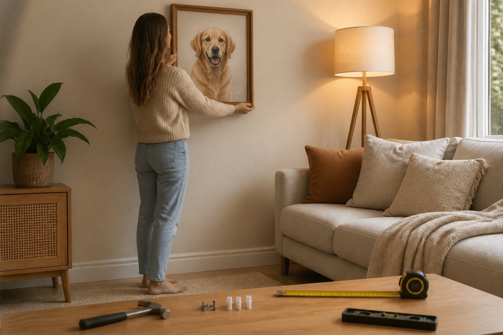
Hanging height is the most common mistake, and it's easy to fix. Centre of the artwork at 145 to 150 centimetres from the floor, average eye level for a standing adult. Most people hang art too high because they judge it while standing right underneath it.
Here's the full sequence:
- Measure the wall and mark your centre line with painter's tape, not a pencil.
- Hold the frame against the wall at the marked height and step back at least three metres. Adjust before you drill.
- Check the sightline from your usual seat. If you'll mostly see the portrait from the couch, the couch is the view that matters.
- Mark the hanging point using the frame's actual hanging hardware, not a guess at the top edge.
- Drill, anchor, hang, then level. Use wall anchors for anything heavier than a small print, especially on plasterboard.
- Live with it for a week before adding anything around it. You'll notice things on day four that you missed on day one.
Where to Hang It So It Actually Means Something
Most guides stop at height and spacing. But where a pet portrait sits in relation to the room, and to your pet's actual life in it, changes how it feels every day. A few patterns worth trying:
- Above the spot your pet actually rests. If your dog sleeps beside the couch, a portrait above that end of the couch reads as a companion piece to a real, living thing. It's a small thing. It's also the thing guests notice.
- On the wall you face when you sit down. Not the wall behind you. The portrait you look at while you're having a cup of tea on a Sunday morning is the one that earns its place.
- Near the door your pet waits at. If your dog watches the front door every afternoon, a portrait on the adjacent wall turns a waiting spot into a small ritual.
- Not directly above the television. The TV will always win the eye. Give the portrait its own wall or its own corner.
The pattern among people happiest with their portrait: they hang it where they already look, not where there's simply space.
Gallery Wall, Gallery Rules
If you're building a gallery wall around your pet portrait, keep three things in mind. Space pieces 5 to 8 centimetres apart, closer looks cramped, wider and the group stops reading as a group. Treat the whole arrangement as one shape: lay it out on the floor first, or cut paper templates and tape them to the wall. Ten minutes saves a wall full of unnecessary holes. And give the pet portrait the anchor position, centre or lower-left if it's the largest piece, or more breathing room than its neighbours if it's smaller.
For a mixed wall, pair a Library Cat portrait with botanical prints, or a Wildflower Crown study with soft neutral frames. Browse the full range at beartistic.club/styles if you want to see how the 176 styles sit alongside each other.
Frequently Asked Questions
How do I match a pet portrait to my existing living room decor?
Pull three colours straight from the room, such as the sofa, rug and one cushion, then pick a style that shares at least two of them. A monochrome room suits fine-art black and white styles, while warm timber and linen suit painterly watercolour pieces. Frame selection matters too: thin black frames read modern, while oak or gold suits traditional decor. Order a free preview first and check it against your wall in daylight before committing.
What are the most popular styles for custom pet portraits?
The most requested pet portrait styles are painterly watercolour, fine-art black and white, and royal or renaissance portraits with velvet and gold detail. Character pieces, where your dog appears as a chef or sea captain, are the fastest-growing request for gifts. Style names like Royal Portrait, Studio Noir, Library Cat and Head Chef each live on their own page, so you can see real examples before choosing. There are 176 styles in total.
Should I choose a canvas or framed print for my pet portrait?
Canvas suits textured, painterly styles and rooms with soft lighting, because it needs no glass and handles glare well. A framed print gives you more control over the look, since the frame becomes part of the colour palette. In bright rooms with big windows, framed prints with matte finishing cut reflections better. Either way, keep the piece out of direct sun, as UV light fades any print over time.
How many pet portraits should I hang in one room?
One large piece works as a focal point above a sofa or fireplace. If you want more, group them as a gallery wall of three to five pieces with consistent spacing, roughly 5 to 8 cm between frames. Odd numbers balance better than even ones. Mix portrait and landscape orientation for visual balance, and keep at least one supporting piece, such as a mirror or plant, so the wall does not feel like a shrine.